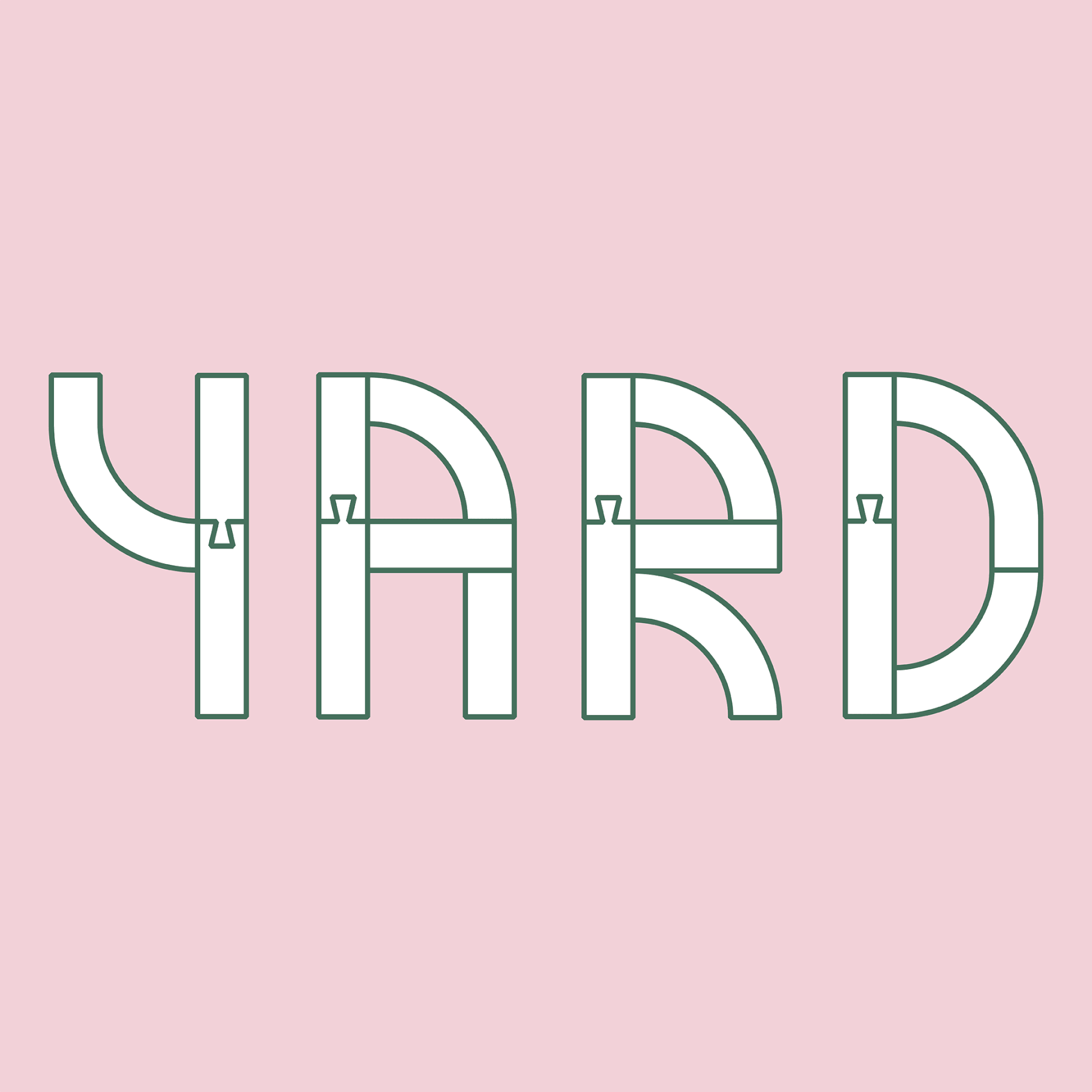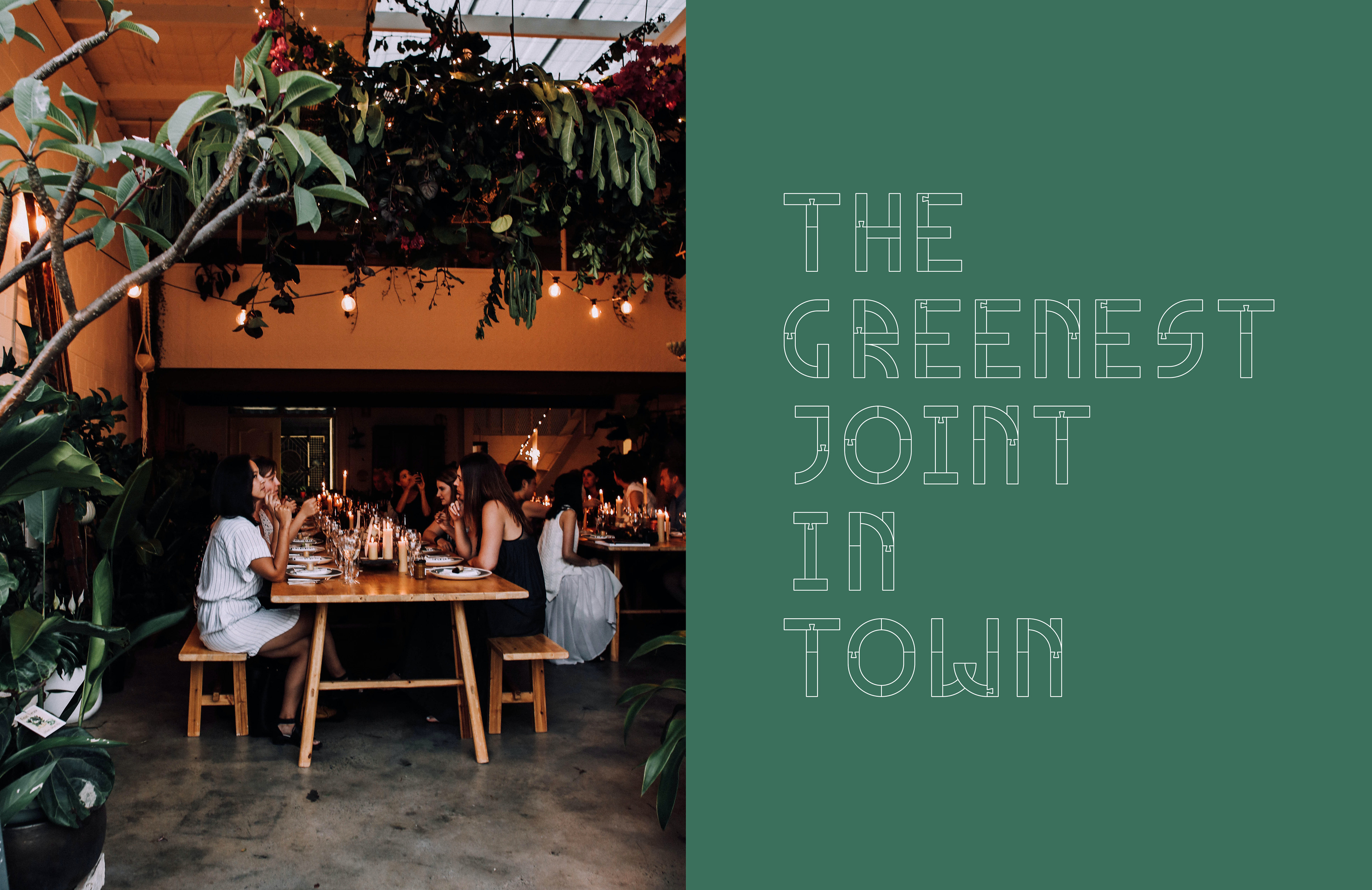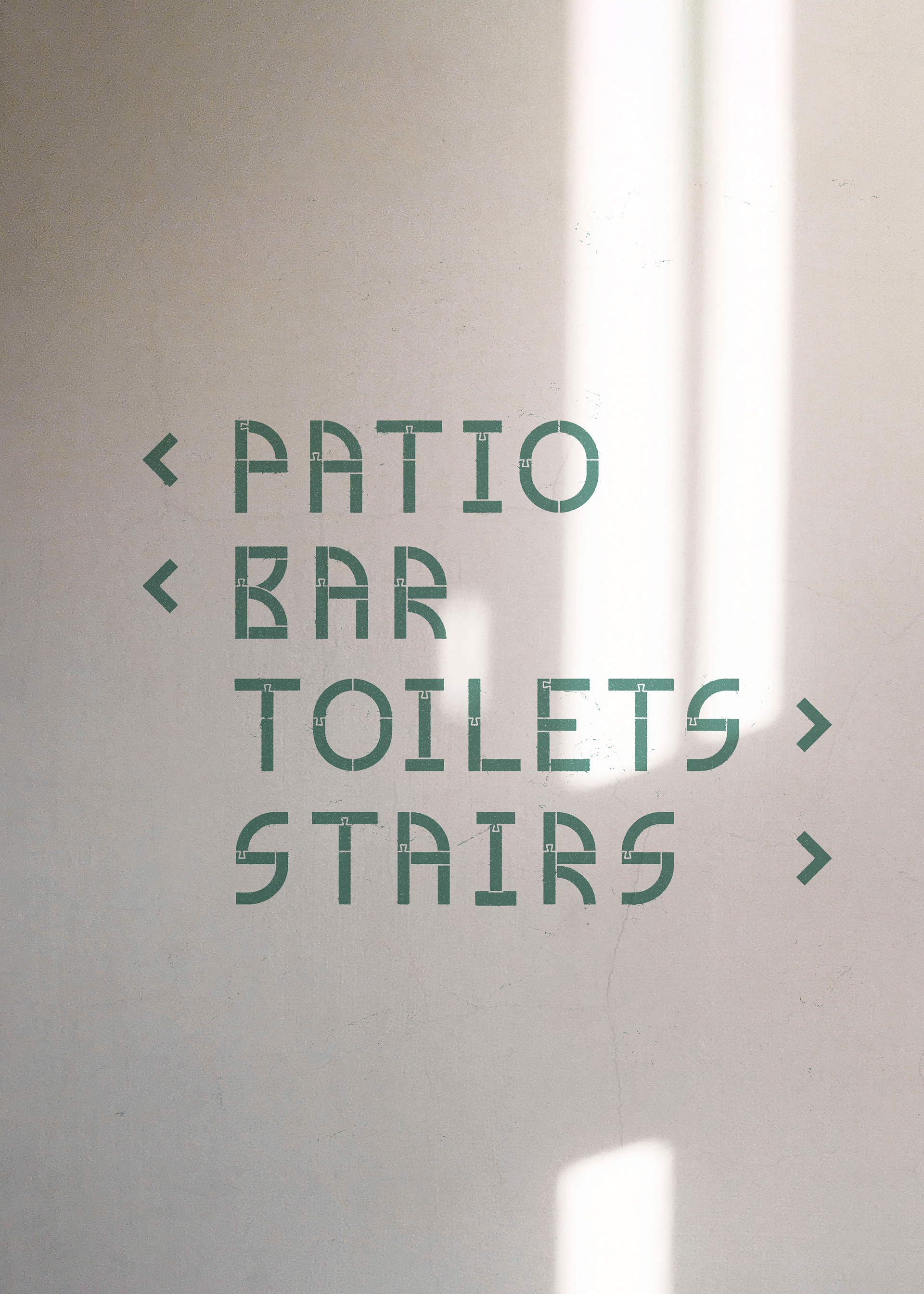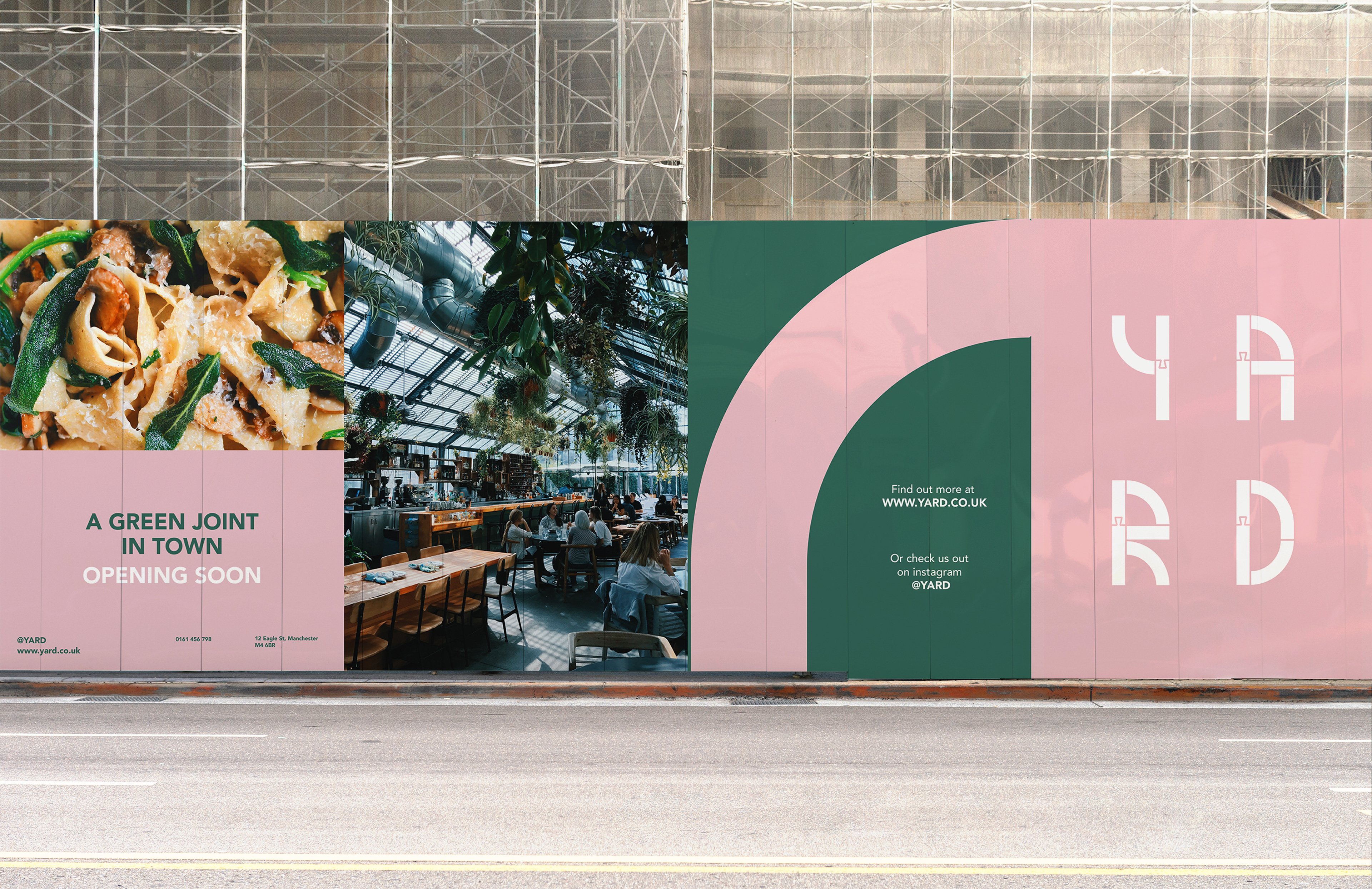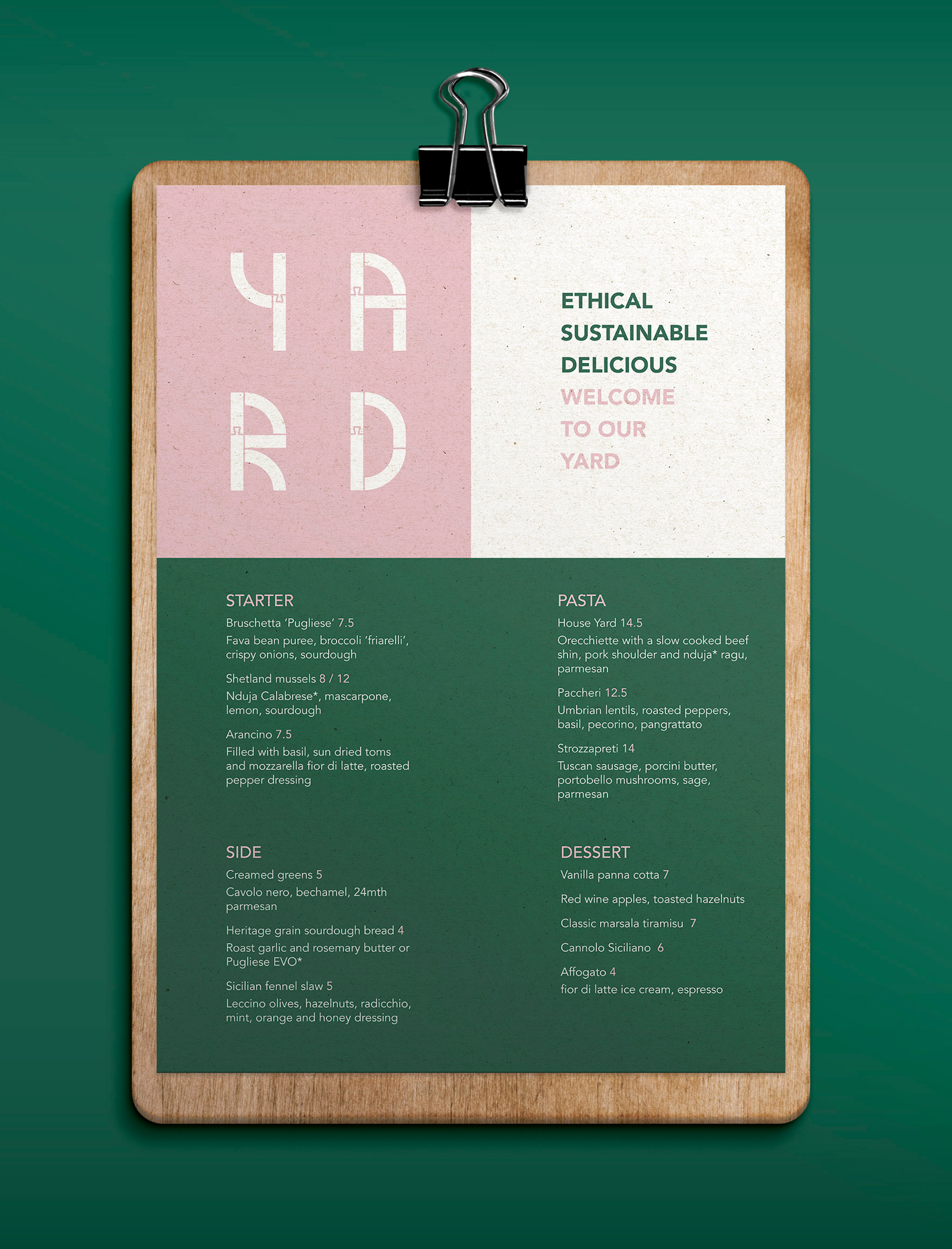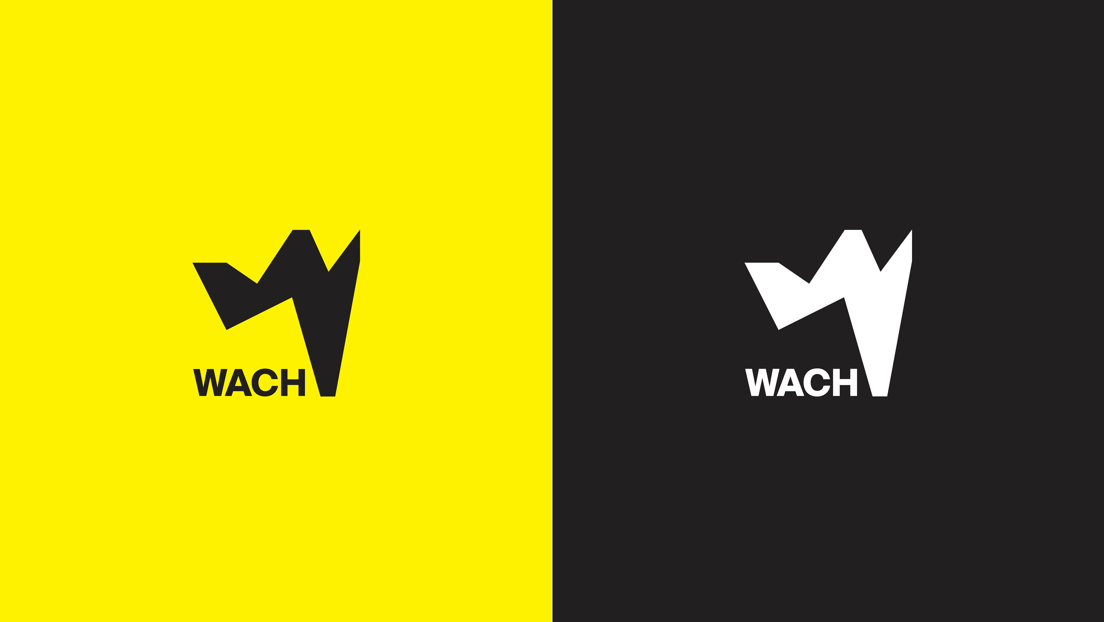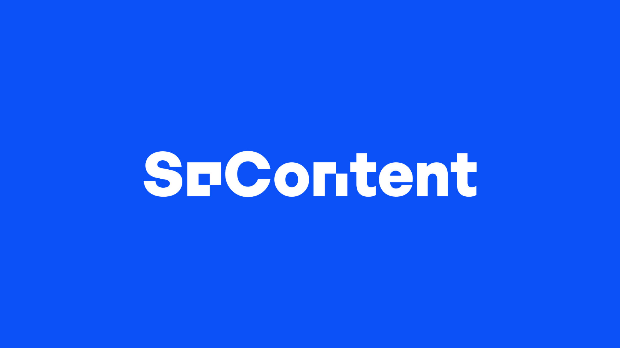
Brand Identity & Type Design
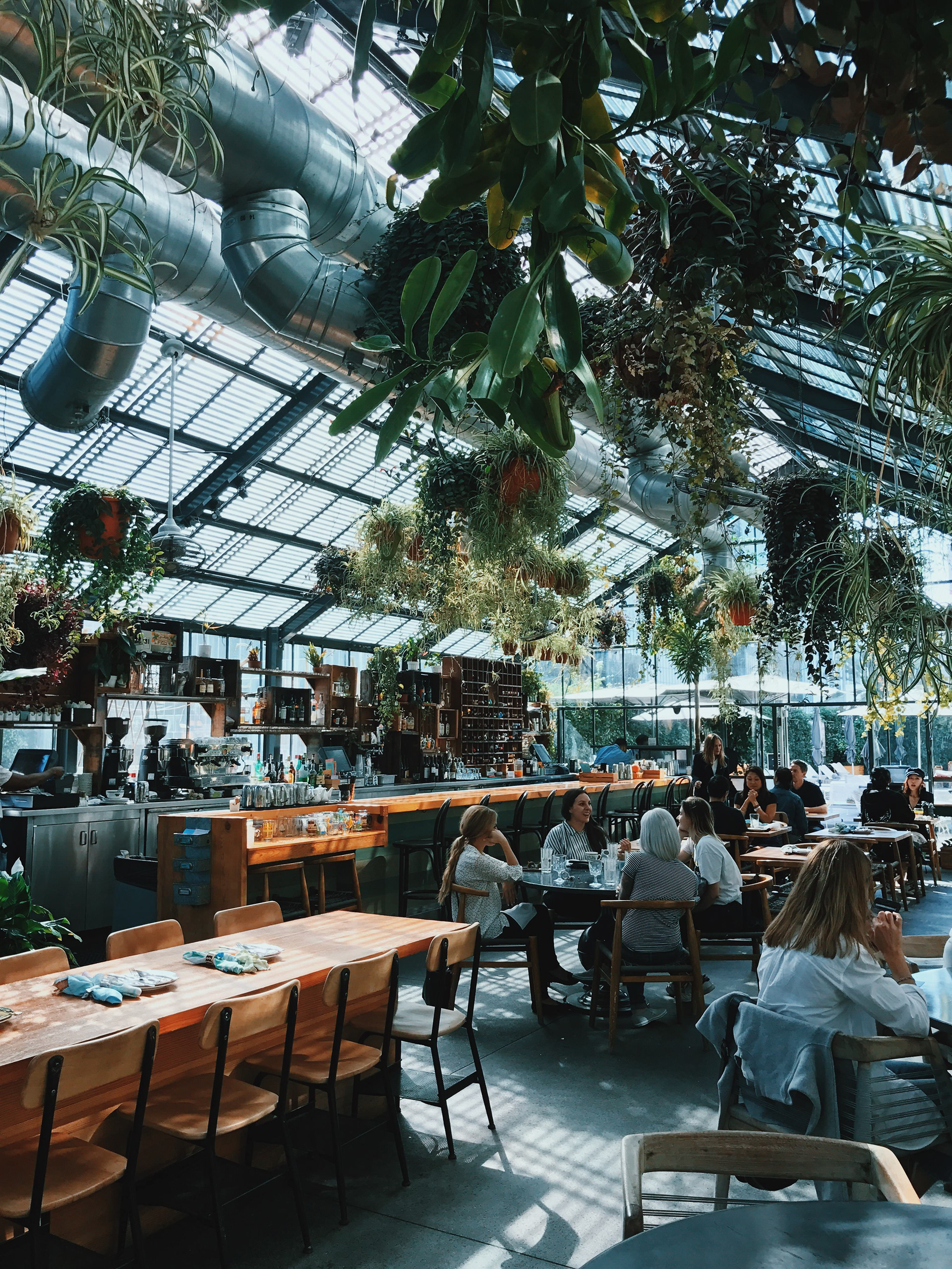
A custom typeface and brand identity for a new carbon-neutral restaurant, inspired by the building’s history as a lumber yard.
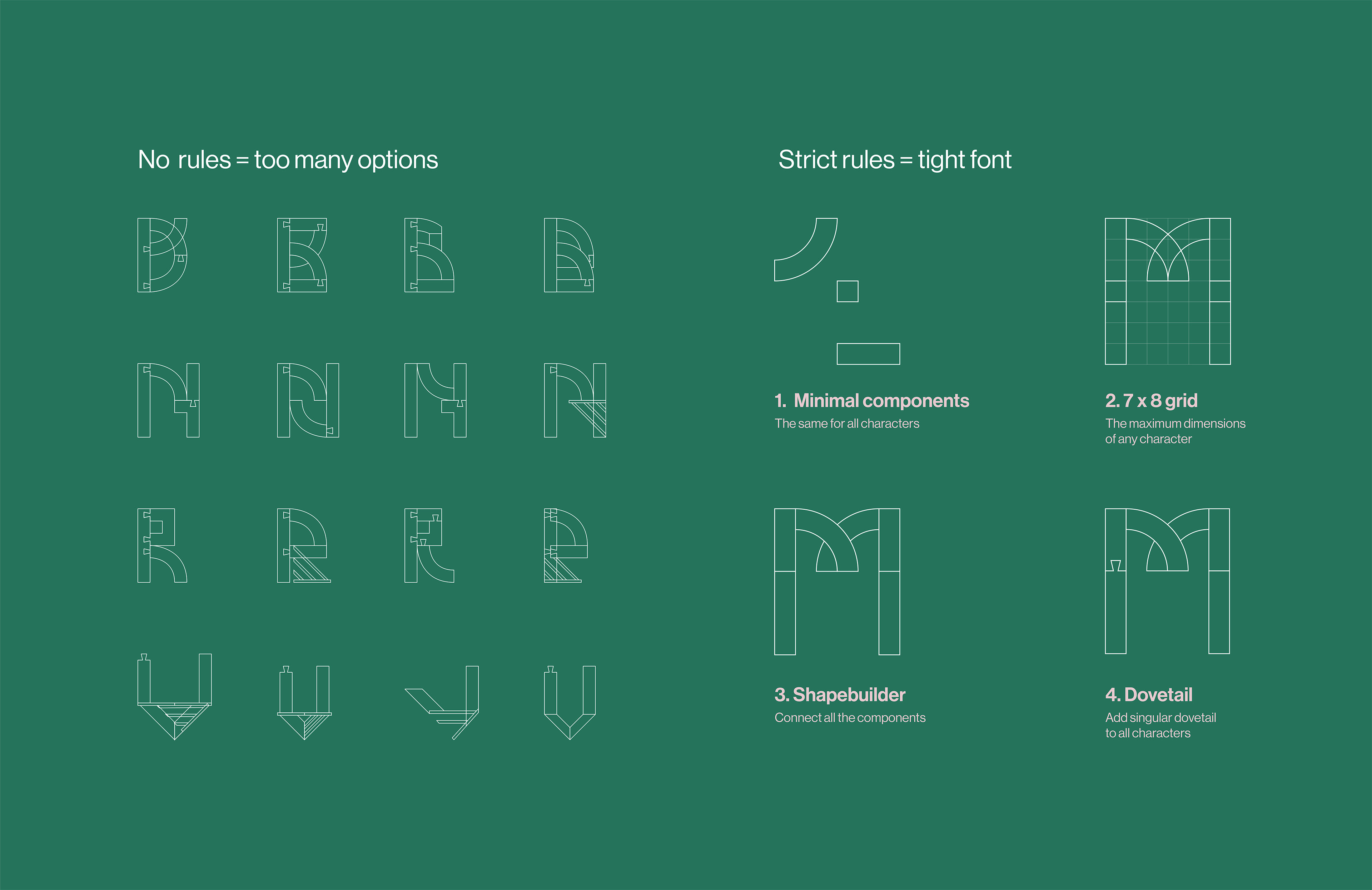
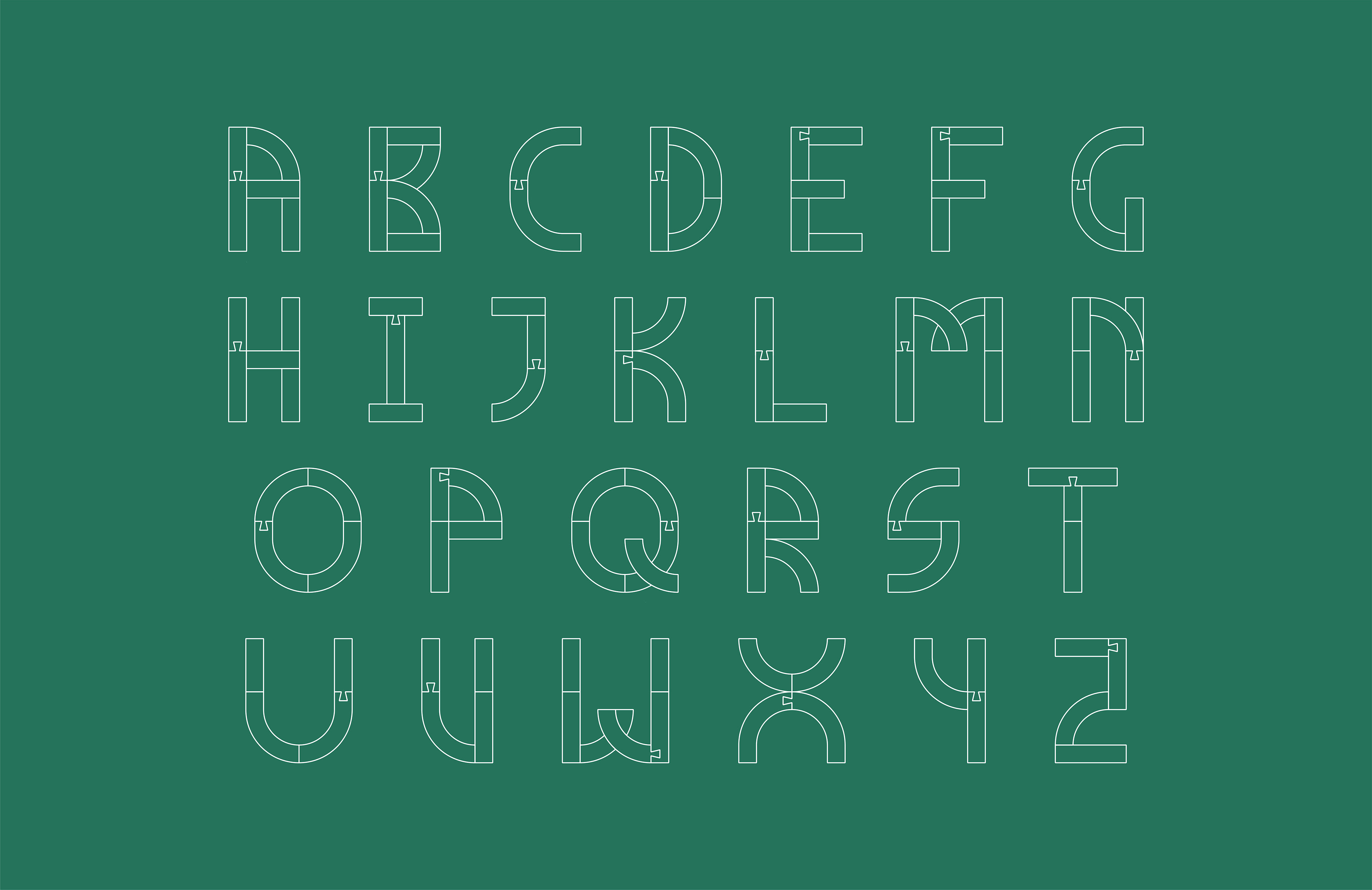
The font was created by using a few simple shapes as components: a quarter circle, a rectangle, a square and then a ‘join’ shape, all arranged on a 1:1 grid.
The only rules I created were to never use any other components and to add only one dovetail shape per letterform.
Overall I loved this project due to how many iterations I created for each letter, the ease of creating some letters, C, W, Q, and the PAIN of some others, S & Z (the Z still resembles a 2 a bit too much...)