Icon Design
Justin from Eurol approached me after they’d recently undergone a brand refresh with a new website. Eurol needed a new set of icons to help communicate their products and services on their website and packaging.
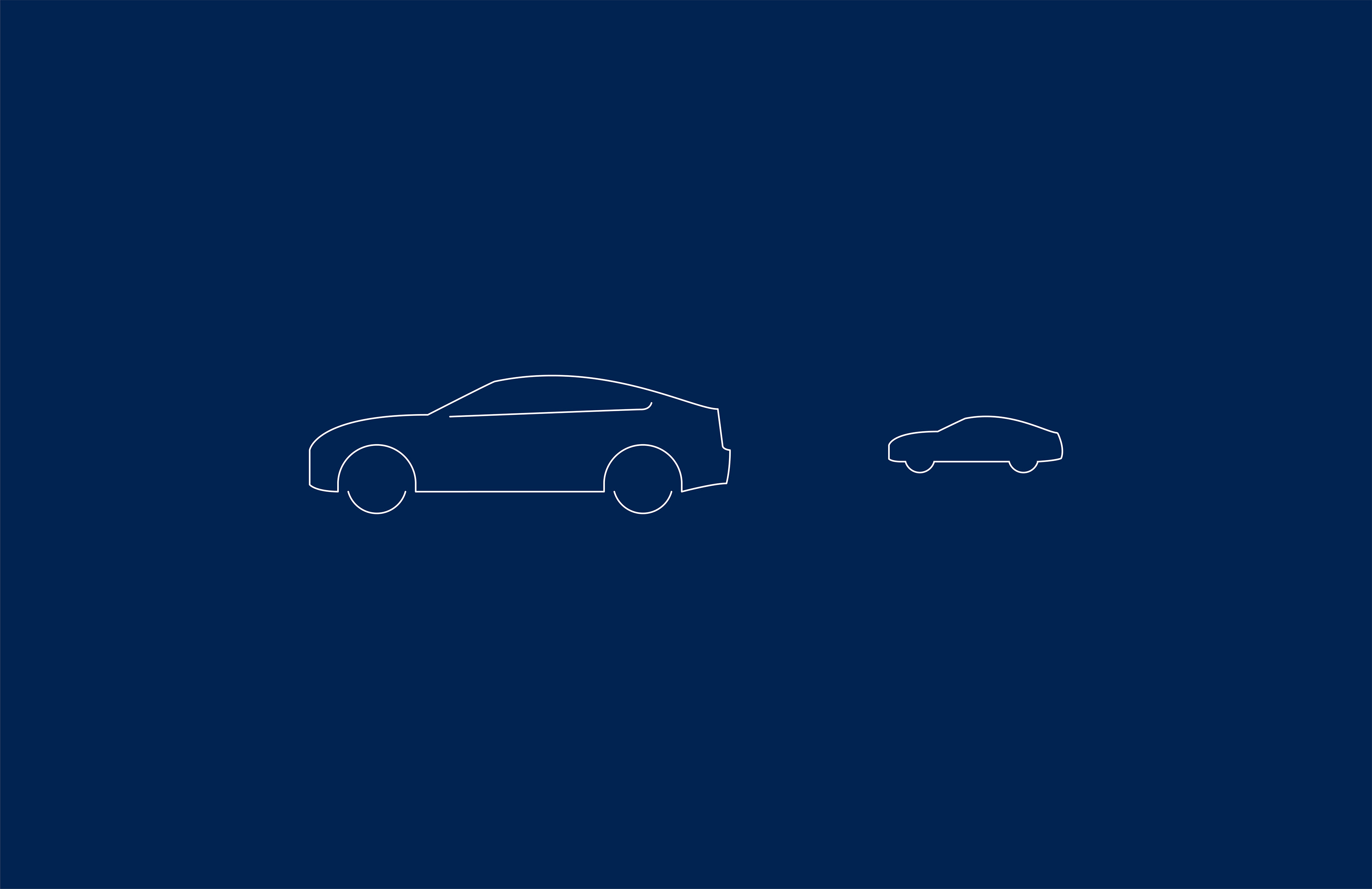
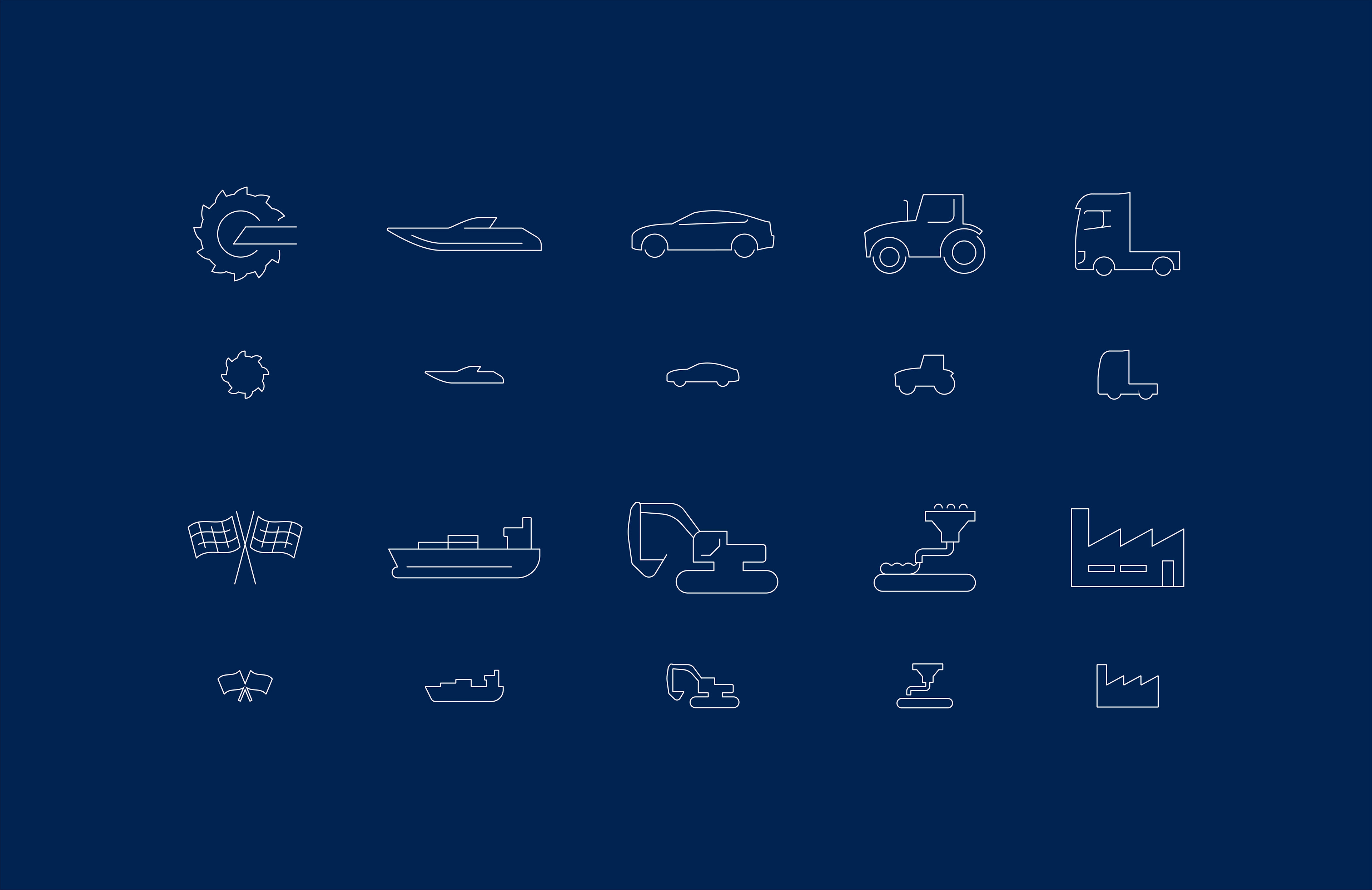
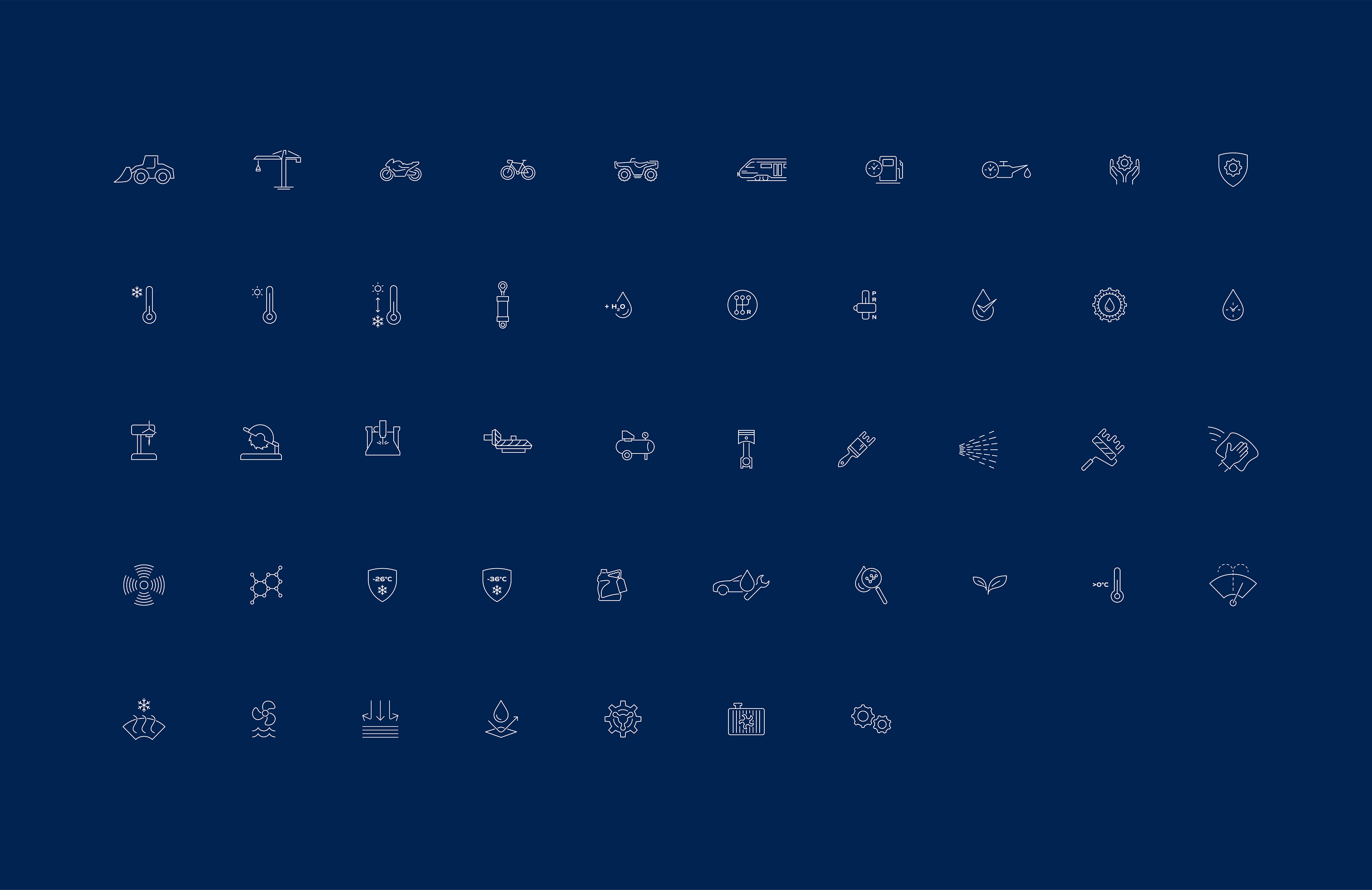
The icons were split into two phases. Phase 1 was ten icons that show their main sectors. I encouraged Justin that 2 versions of each icon would be benficial: one main verison to be used across print & digital and a simplified version to be used on digital buttons. Phase 2’s deliberables were 48 icons to cover everything they woud need to show as a company.
The main visual goals for these icons was for them to feel unique, modern and convery their values of ‘speed, power and performance.
Client feedback: Justin Eleveld
“I had a fantastic experience working with Will, a talented icon designer for Eurol Lubricants. He was professional, easy to work with, and had a great eye for design. Will created a cohesive set of icons that really looked like they belonged together.
He was transparent and communicated well, which made working with him a breeze. Will’s work exceeded our expectations, and I’d highly recommend him to anyone needing top-notch design skills.”