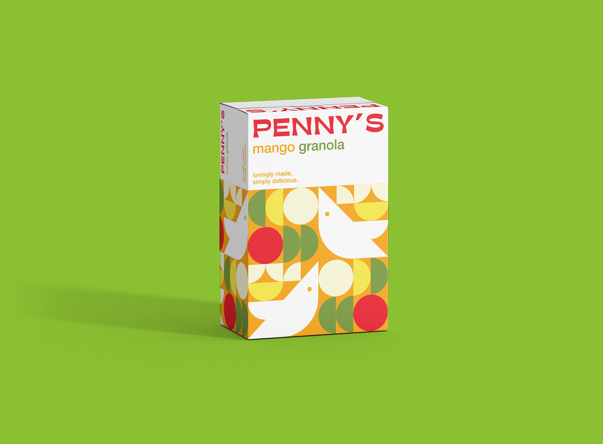
Brand Identity & Packaging Design
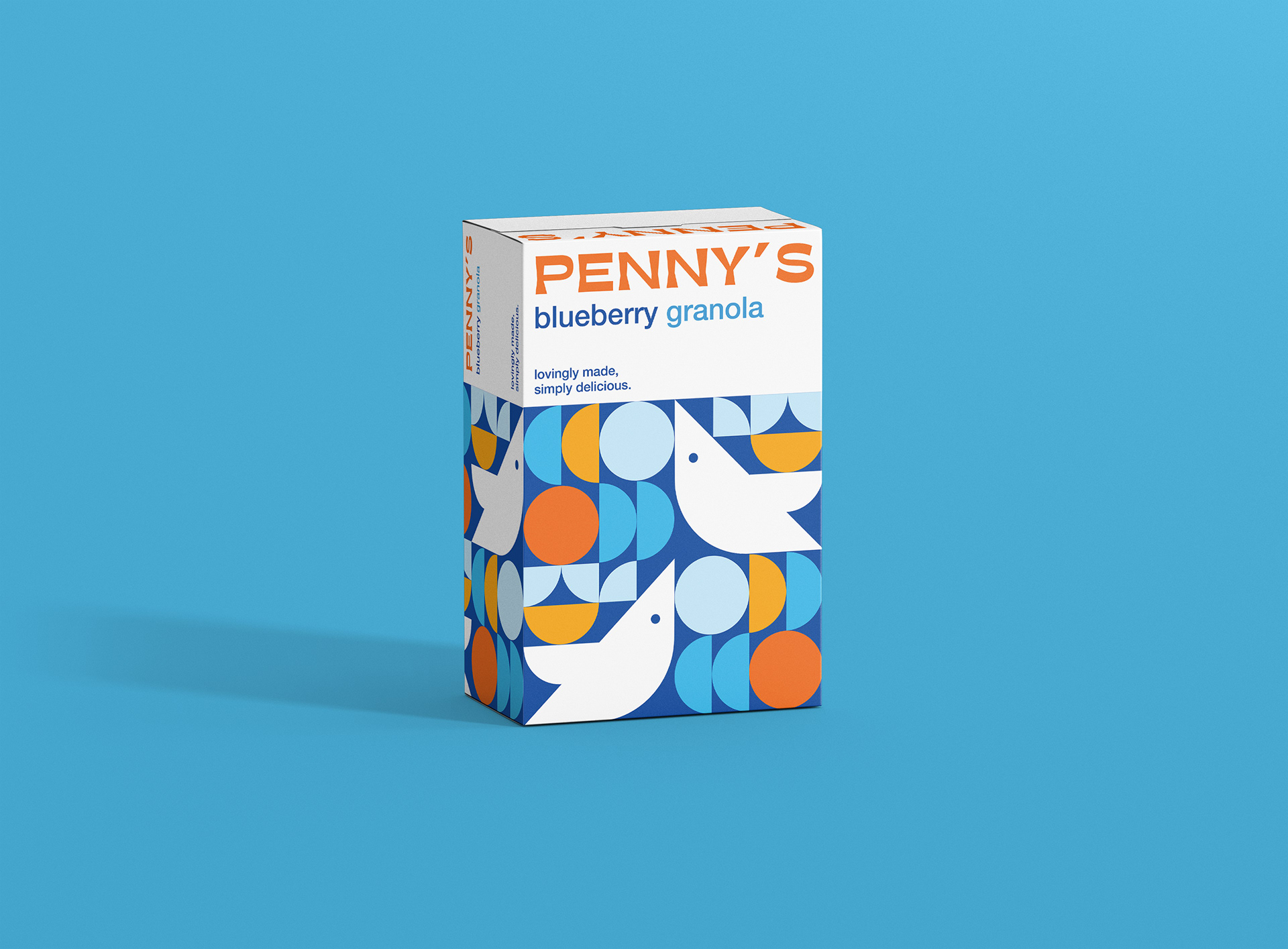
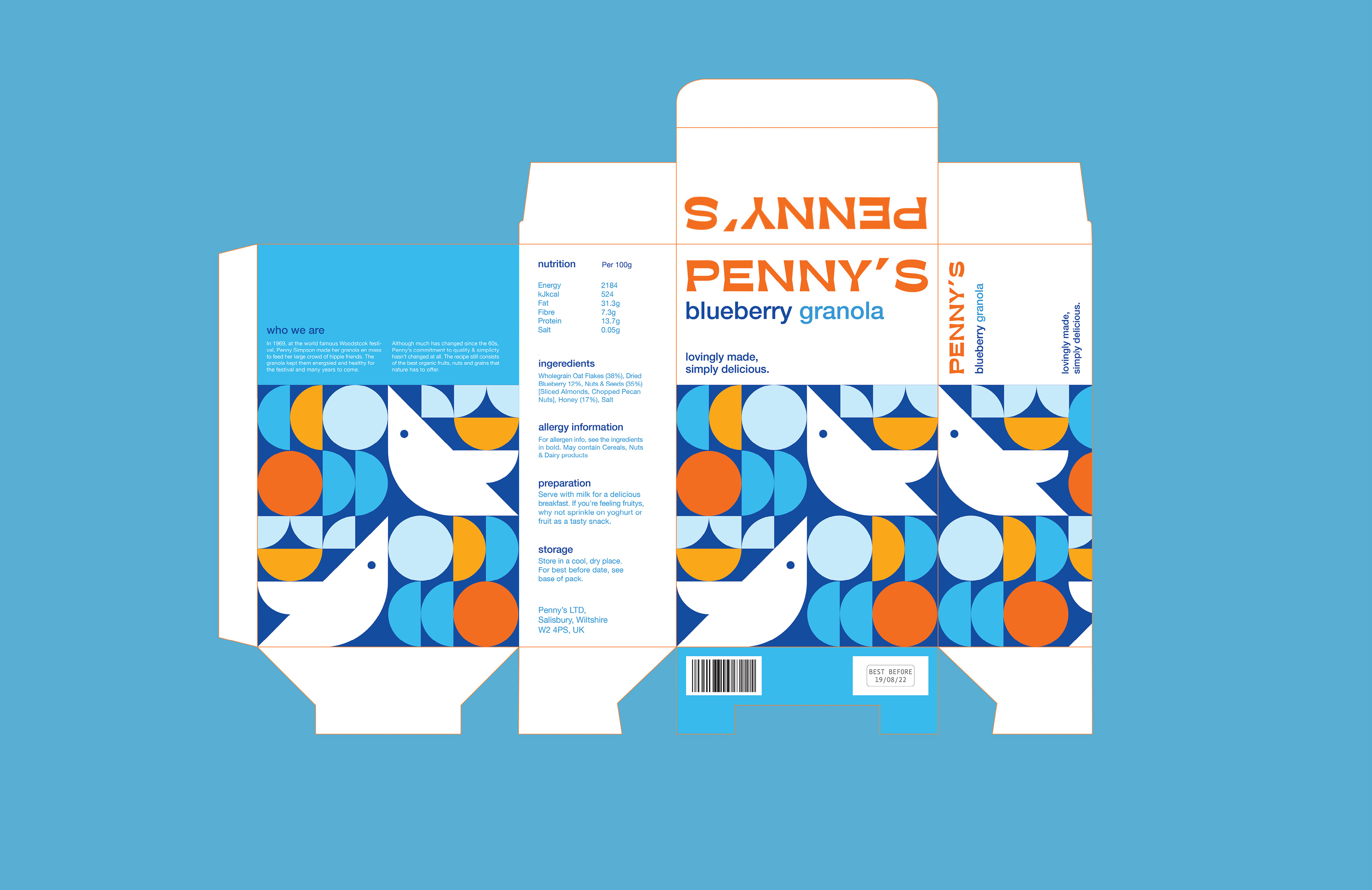
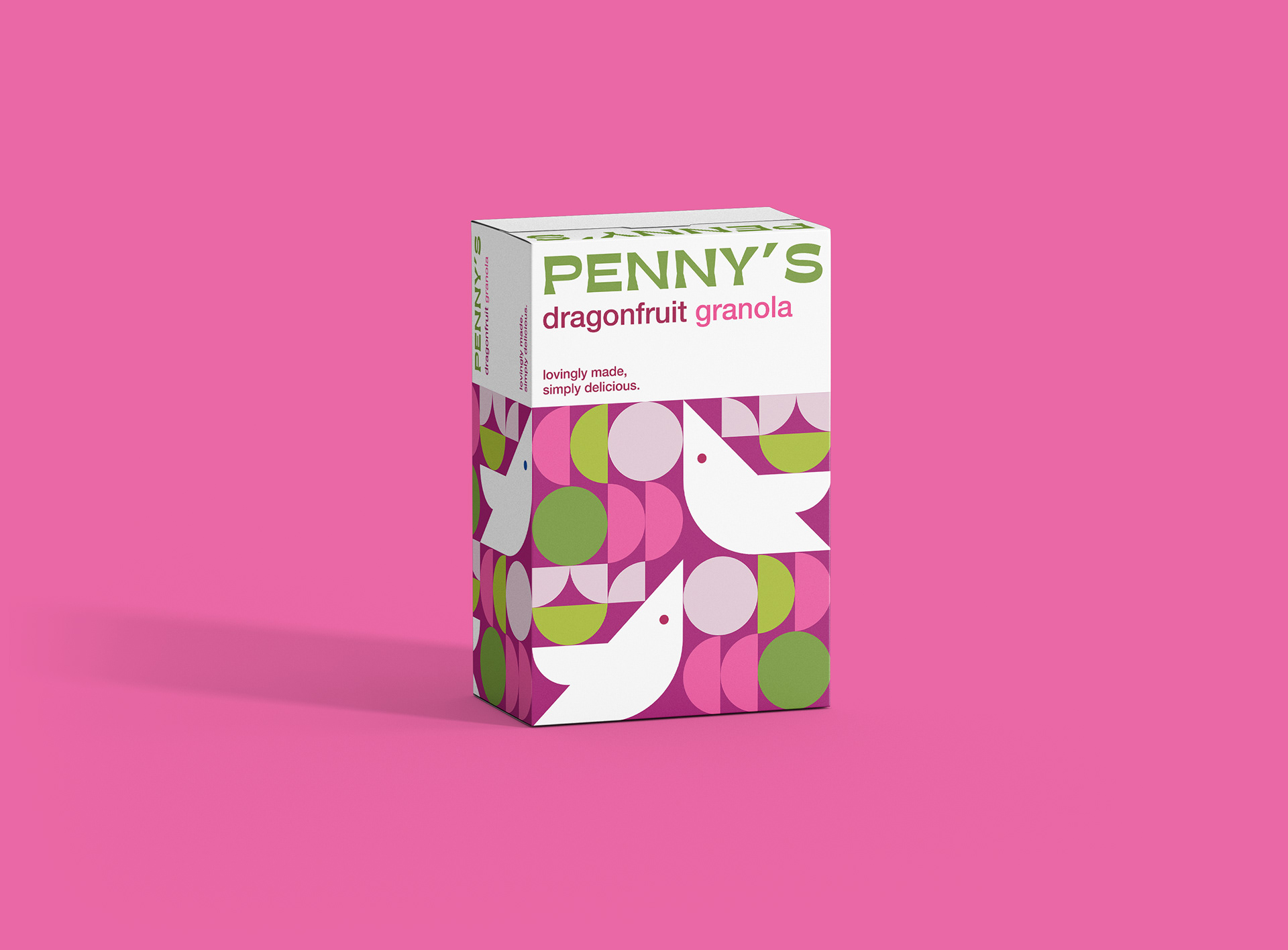
Bright and nostalgic packaging and branding for Penny’s, a retro cereal company inspired by its Woodstock origins.
In 1969, at the world famous Woodstock festival, Penny Simpson made her granola to feed her large crowd of hippie friends.
Although much has changed since the 60s, Penny’s commitment to quality and simplicity hasn’t changed at all.
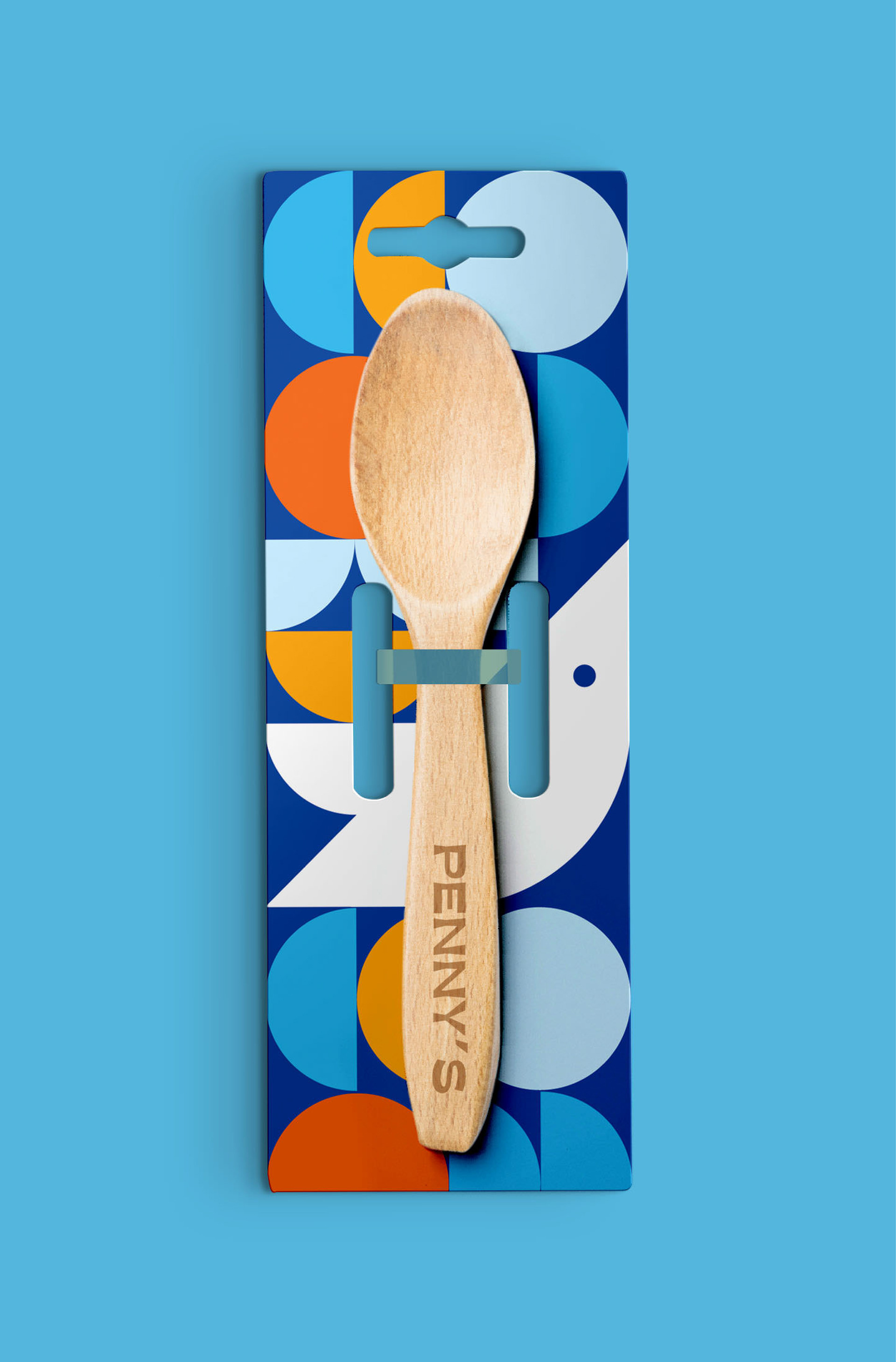
Penny’s logo is an updated and simplified iteration of an original Woodstock illustration, the brand patterns for Penny’s are inspired by the geometric designs of the late 60s and the packaging’s colours reflect exactly what’s inside- colourful, fresh and natural.